Posts tagged bad

How Reddit Got into Trouble

Reddit ohhh Reddit the “community”-driven social media site, is currently facing a major crisis as the “community” grows increasingly dissatisfied with recent decisions, leading to a strike by moderators and an exodus of key users. This situation kinda highlights a crucial error made by a lot of social networks, they think that users seek only the services, but in fact they mostly seek connections and a kind of sense of community, and erecting barriers to access ultimately erodes what users want and need.

I think the key factors for Reddit’s success were that they capitalized on other similar platforms shooting themselves in the foot (I’m looking at you, Digg), letting each topic create a community around it and let each community grow, and finally being somewhat open with an easy API and letting anyone use the site in creative ways, something that other platforms have been cracking down on for years, like Facebook, Twitter and such.

But here lies the crux, if the users and mods are the ones really creating the content and moderating it, then the only thing Reddit needs to-do is keep the platform running and run ads and account subscriptions, which seems like an ideal setup.

Unfortunately, it seems that Reddit like other networks before it, wants more, and as slowly been creating new revenue streams, creating more schemes, things like pushing web users to its kind of lousy app, app only features, having a new slow design that favors Tiktok like mindless media consumption instead of community consumption and interaction, not implementing or supporting the mods, pushing gimmicks like NFT’s and community awards, creating restrictions and paths to make it increasingly harder for mods to manage and grow their communities, and pushing the users to a more “reddit is the main page” instead of “reddit is all about the communities”.

Also, the current path Reddit is heading is that instead of 100,000 small interesting and quirky communities, they really just want and promote 100 super large communities, with never-ending posts of boobs, cute and fails, If it sounds like TikTok, Facebook, or Instagram, you wouldn’t be wrong, and that’s… a shame, more of the same is boring, it might make money, but it has no future; they will be just another one..

And even after all of this, Reddit is still apparently in the red, I think it’s in the red because it’s badly managed, it wants to run like a Facebook with huge budgets and staff working on a billion unrelated things, a network like Reddit can and should run more slim and could be profitable with little adjustments and by cooperating more heavily with its mods and communities, just look at Wikipedia!

But no… Reddit and its CEO Steve Huffman view Reddit as a cash cow that has just not been milked enough, so they decide to turn the free API to an extremely expensive and restricted API so as to kill all competition and fuck what the communities need or want, its literally another one of those killed by a thousand cuts, when this time he just cuts a little bit too deep and the cow decides to give a nice kick, so what happens…

Thousands of Reddit moderators initiated a blackout, blocking access to over 8,000 subreddits (including my community). With several demands, like the implementation of accessibility features for blind users and revisions to the API to support third-party apps, both in price and restrictions.

And this puts Reddit in a bind, since the value of Reddit is its constant flow of content, its communities, and its enormous database of information, so if channels go dark, all of this disappears, if Reddit pushes forward and channels start deleting, then this treasure trove starts depreciating even more, if Reddit decides to kick its mods and force open channels, then who is going to manage and moderate? Is Reddit who is the red going to be able to afford to pay moderators? Naaaa, it will turn into a dumpster fire…

This, of course, is not what everyone wants, mods are weaponizing their channels and communities to try and pressure the company, but the company that was supposed to be all about community doesn’t seem to care, and this opens up a bad precedent of communities not trusting the platform, it’s all about the money and fuck the ethics, so here we are in a tug-o-war with some channels open, some channels restricted, and some channels private, all waiting to see who folds first.

I’m writing this because I’m also Reddit user and a mod, so my views are not exactly the mainstream, but alas my channels are closed for the time being, so I have some skin in the game, but I’ve been burned before, one of the reasons that 90% of what I manage is 100% under my control is because I’ve been rugged pulled before, several times, I’ve joined great platforms with awesome features and I’ve sometimes spent years making something amazing for that platform to eventually see it all just crashing down, my work erased, decide that I should pay 100x more or change the rules for no reason, and most of the time there is no recourse for me, it’s a deep breath and move on, so this time with Reddit I’ve decided to make a stand, it’s a small stand but its one nevertheless because what makes Reddit strong it’s the communities and mods and if these turn on Reddit then the cow dies… a slow painful death…

Blogger Changes for Worst

Ok, I admit it! I use Blogger, actually i use it on 2 of my sites (this site! and on ecchi), the reason for that
is mostly legacy, that and they are 2 fanboyish sites, where i randomly
post random stuff, so there is no big need for more control or whatnot,
they exist mostly as scraps and places to vent, after all thats why
sites like Blogger, Tumblr or WordPress.com exist, to make it easy as
pie to publish content, or so it would seem.

So why am im not
enjoying the new Blogger? its a much needed refresh after mostly years
of neglect! True, and change in my view is mostly always a good thing,
but this new blogger feels and seems like change for the sake of change,
like when Adoble launches a new product line or Firefox launches a new
version (both have a tendency to instead of improving the old to push the new), so what are my gripes?

The Blogger Dashboard

Clearly
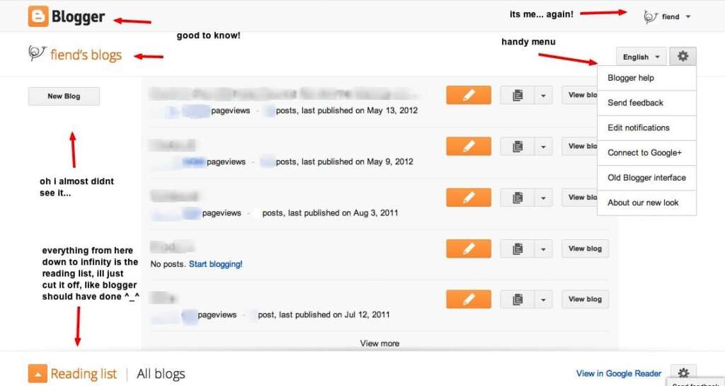
the new dashboard is a remake of the old one, thats fine with me, also
there are some good things about it, showing some micro stats and some
quick links (although those were also on the old layout), thats good! if
you have 2 blogs, but if you have 20, its pretty shitty! the whole
design, is so wide and white that you are lost in it, it takes so much
room that only 5 blogs appear.

Also the new dashboard is
incredibly slow, everything takes a couple more than it should, Google
sees html as slow, AJAX is the way of the future, everything updates
itself, its all seamless and awesome!!! well No! Not really, the
whole thing is a mess, its like when you click on a link on a html site
you feel the microseconds to jump to the next page, its like a snap
feeling (page refreshes to show a new page), here you have the slow drag
feeling, the page doesn’t refresh but it loads… eventually.

Also
whoever designed this was high on orange and on wasting space, from the top down, first
grey bar you have the blogger logo and on the other side my nickname and
some links to edit my profile or google account… great use of
space, especially on 2 features that… humm everyone uses all the time?

Second
bar you have my nickname again and the title! my blogs! oh how sweetly irrelevant, on the other side of the bar you get 2 drop-downs, one for
language (something i like to see all the time and change constantly to keep myself
fresh) and options, of course all of these options are absolutely
positively super duper handy! Here they are:

  • Blogger Help – The first option? I think this needs no further comment.
  • Send
    Feedback
    – Hum? Im seeing double, in the bottom there is a button saying
    the exact same thing, hell that button is on every page!
  • Connect to Google+ – Yes we all know Google hates Orkut.
  • Old
    Blogger Interface
    – My favorite option! i think it should have its own
    button and be called “Go back to the new new blogger, its the same as
    the old but still better than the new”, ohh maybe thats too much text
    for a button, but im glad it made it into this crowded options menu.
  • About New Look – For when “Blogger Help” and “Send Feedback” is just not enough!

Then
you get the blogs displayed, of course to create a new blog, you just
click the button “New Blog” you cant miss it, cause that tiny button is
taking a 1\3 column on the left side, I also like the responsive design
tweaks, but just if you have 1024px or lower screen, if you go higher
you just get extra empty space… how responsive of you.

They
also decided to continue including the reading pane (basically a poor
man’s google reader), who uses this? Let me think of a time i needed to
get into my blogging software to read other peoples shit? hummm suffice
to say its not practical, its not nice, its basically throwing random
feeds at you. Ohh and of course it takes half the screen and there is no
way of minimising or closing it, you just have to try and use a bit of
imagination, and think of a blogger dashboard without that oversized rss
widget!

The new dashboard also hangs/goes into a infinite loop if
you try to login forcing https, yeah, who wants encrypted logins…
what do you have to hide, blogger guy! no one reads your cat blog
anyways!

The Blogger Editor


Did i say
the dashboard was slow? sorry i mean everything is slow, its slow in
firefox, safari and even google’s chrome, its slow by design, if you
concentrate and listen… listen really well… you can actually hear
the screams of javascript dying, thats how slow, unresponsive and
obnoxious it is!

But when it eventually loads something, you are greeted with even more white and orange, its like writing in a Sunnny D comercial, its so refreshing that im actually becoming orange blind.

Here however there is a somewhat better use of the white space, but still their “responsive design”
leaves a lot to be desired, their sidebar on the left side only
minimizes if your screen is small, if its large its always open, no
choice, also on the “Compose” side of things you have a tiny tiny box to
write, while on the “HTML” you have a large box, and going back and forth
actually loses formatting (a space written on html is not translated into
compose, you literally have to put the html tag for space or
paragraph), thats just silly, the HTML part on a editor is not really to edit html its to tweak the code of a post…

Also your infinite image posting
options, not that its a bad thing, i prefer more than too few, its just a bit confusing, like
you dont know if you are posting images on Picasa or Blogger (or is that gone?) from Picasa or from Google+ or from your webcam, where
do those go? into Picasa or Google+, i dont know… maybe i shouldn’t touch it more!

The New Themes / Dynamic Views


Should i mention those weirdly, barely functional, cooliris wannabe clones (being cooliris kinda a apple coverflowish clone), javascript infilled, bloat hazardous new themes?

Who had this great ideia? Hummm? I bet it was the same guy that designed the new blogger, he just went nuts on a power-trip, the new themes are simply not good, they break a lot of function and usability for the sake of fancy effects, blogs are to be read and enjoyed, not to be wowed by fancy sliding effects, although nice, they add little to nothing for the reader/visitor, it actually makes it worst.

  • These new themes are slow! – You betcha, a theme that has a loading icon is already a sign of bad things to come (like a software with a splash screen), especially when blogger staff says they load 40% faster… what? ohh you mean after the long loading signs it becomes faster? ohhh no? it must be one of those “perceived faster”, or maybe a sidebar is 40% of the design, if we kill a sidebar… 40% faster! by the way the screenshot on top of a dynamic view loading was super easy to take, no need to hurry before it finished loading…
  • These new themes are not easy to navigate! – They aren’t! Sure the fonts are nice and readable, but you can choose any font for your blog, but try and navigate anywhere on a dynamic view…  let this scrolling quest begin!
  • These new themes are all basically the same! – They are and half of them aren’t even that nice, and most are made for a specific kind of formated posts, so any average blog will look like shit in them!
  • These new themes have crippled search! – Try it on a average sized blog… i dare you! … to find anything…
  • These new themes have no sidebar! – So they basically want to push oversized, slow jazzed up tumblr themes on everyone… nice…

We all know Google quit the “Dont be evil” some time ago, and although i still use some Google products i cant say i trust them all that much, for sure me, like most of you will stay very clear from things like Google+ and Google Drive, as i would never sign up my cat to Google+ , if not the subpar facebook clone, the risk of his account getting banned and all his cute kitty pictures being lost forever… NOOOOO!

But when did Google stop making clean, simple and fast designs? Google Search is as bloated as ever, sometimes i have difficulty searching cause im writing something and instant is firing off and pages are loading and i realise that i cant even concentrate on what i was searching (and yes i know you can disable it, but how many times have i disabled instant or safe filter to have them show back on later on, even when im logged in!), what happen to the mili-second clean pages of search? what happen to clean, simple UI’s and focused design on one thing that does one job awesomely well!

Well, yeah the new updated Blogger sucks, its slow, buggier, way more complicated than it
should be, not that user-friendly and overall a disappointment, and
most likely when this new blogger turns into the official one, ill have
to pack my bags and move over to tumblr, apparently the only sensible offering on
the market today.

Note: Why no WordPress.com?, well I also have
some minor issues with wordpress.com since they seem in comparison with
blogger and tumblr, the ones that offer less options and flexibility, ohh and worst! they are way more picky about the kind of content they let you publish (the 2
blogs i had there were “suspended” at one point or another), yes i know its their choice and
platform, and yes they eventually un-suspended me, but that just makes
me stay away.

Note 2: As I wrote this post on Gmail and
copy pasted to Blogger, im sure Google tracked that action down, later today some Google manager will look at that log and think … humm this should be on the next Gmail build! so just after the Gmail+, Google will launch the brand new Gmailer+ hey and its a success already, from day 1 it has a bazzilion users! Blogging right from your Google+ i mean Gmail, ahhh you know what that means! Humm now that i think about it… at least it would be a better Blogger!

S2R is Over with Feedburner

This was the last drop, the only reason for using feedburner in more than 20 of our sites was that it provided a good and reliable storage of the feeds, the ability to manage the feeds and possibly monetise it and above all else because of the feed stats, but in a week time since we moved the feeds from feedburner to google feedburner, the bad service is even worse, its a case of google doing again a shit poor job of a service they bought and in our case its the final drop, and we are dropping the service all together, we prefer the clean workable and always available feed that our sites provide than the broken down mess from google’s feedburner, we are done and we recommend most users to drop them as well… really no point, you lose more than what you win…